
我們在使用css來布局時經(jīng)常需要進(jìn)行居中,有時一個屬性就能搞定,有時則需要一定的技巧才能兼容到所有瀏覽器,利用css來實現(xiàn)對象的垂直居中有許多不同的方法,比較難的是應(yīng)該選擇哪種正確的方法。比如我們都知道 margin:0 auto;的樣式能讓元素水平居中,而margin: auto;卻不能做到垂直居中……下面就css居中的一些常用方法做個集中的介紹。
首先是水平居中,最簡單的辦法當(dāng)然就是:
margin:0 auto;
也就是將margin-left和margin-right屬性設(shè)置為auto,從而達(dá)到水平居中的效果。
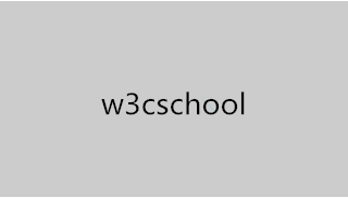
<div class="wrap">w3cschool</div>.wrap{
line-height: 200px;/*垂直居中關(guān)鍵*/
text-align:center;
height: 200px;
font-size: 36px;
background-color: #ccc;
}
<div class="parent">
  <div class="children"></div>
</div>
.parent{
 margin:0 auto;
 width:200px;
 height:200px;
 background-color:red;
}
.children {
 width: 100px;
 height: 100px;
 padding: 50px;
 background-color: black;
 background-clip:content-box;/*居中的關(guān)鍵*/
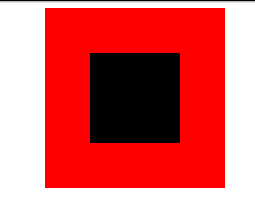
有許多 hacks ,負(fù) margin,影子元素 ::before 等。如果你的內(nèi)容不是固定大小的話,它們大部分是很脆弱的。
用 position 加 translate translate(-50%,-50%) 比較奇特,百分比計算不是以父元素為基準(zhǔn),而是以自己為基準(zhǔn)。
示例:
<style>
#ex3_container{
width:200px;
height:200px;
background-color:yellow;
position:relative;
}
#ex3_content{
left:50%; top:50%;
transform:translate(-50%,-50%);
-webkit-transform:translate(-50%,-50%);
background-color:gray; color:white; position:absolute;
}
</style>
<div id="ex3_container"><div id="ex3_content">Hello World</div></div>
這個技巧相當(dāng)囂張,同樣適用于沒固定大小的內(nèi)容,min-width,max-height,overflow:scroll等。
父容器元素:position: relative
.Absolute-Center {
  width: 50%;
  height: 50%;
  overflow: auto;
  margin: auto;
  position: absolute;
  top: 0; left: 0; bottom: 0; right: 0;
}
注意:高度必須定義,建議加 overflow: auto,防止內(nèi)容溢出。
內(nèi)容元素:position: fixed,z-index: 999,記住父容器元素position: relative
.Absolute-Center.is-Fixed {
  width: 50%;
  height: 50%;
  overflow: auto;
  margin: auto;
  position: fixed;
  top: 0; left: 0; bottom: 0; right: 0;
  z-index: 999;
}百分比寬高,最大、最小寬度均可以,加 padding 也可以
.Absolute-Center.is-Responsive {
  width: 60%;
  height: 60%;
  min-width: 400px;
  max-width: 500px;
  padding: 40px;
  overflow: auto;
  margin: auto;
  position: absolute;
  top: 0; left: 0; bottom: 0; right: 0;
}只要margin: auto; 在,內(nèi)容塊將垂直居中,top, left, bottom, right 可以設(shè)置偏移。
.Absolute-Center.is-Right {
  width: 50%;
  height: 50%;
  margin: auto;
  overflow: auto;
  position: absolute;
  top: 0; left: auto; bottom: 0; right: 20px;
  text-align: right;
}居中內(nèi)容比父容器高時,防止溢出,加 overflow: auto (沒有任何 padding 時,也可以加 max-height: 100%;)。
.Absolute-Center.is-Overflow {
  width: 50%;
  height: 300px;
  max-height: 100%;
  margin: auto;
  overflow: auto;
  position: absolute;
  top: 0; left: 0; bottom: 0; right: 0;
}resize 屬性可以讓尺寸可調(diào)。 設(shè)置 min- /max- 限制尺寸,確定加了 overflow: auto 。
.Absolute-Center.is-Resizable {
  min-width: 20%;
  max-width: 80%;
  min-height: 20%;
  max-height: 80%;
  resize: both;
  overflow: auto;
  margin: auto;
  position: absolute;
  top: 0; left: 0; bottom: 0; right: 0;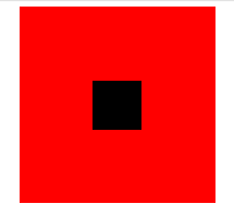
}首先我們還是定義父子div:
<div class="parent">
  <div class="children"></div>
</div>
這里我們利用將子div的margin-top設(shè)置為父div高度減去子div高度的一半,然后再通過overflow設(shè)置為hidden來觸發(fā)父div的BFC,LESS代碼如下:
@parentWidth:200px;
@childrenWidth:50px;
.parent {
 margin:0 auto;
 height:@parentWidth;
 width:@parentWidth;
 background: red;
 overflow:hidden;/*觸發(fā)BFC*/
}
.children {
 height:@childrenWidth;
 width:@childrenWidth;
 margin-left:auto;
 margin-right:auto;
 margin-top: (@parentWidth - @childrenWidth) / 2;
 background:black;
}
<div class="parent">
  <div class="children"></div>
</div>
.parent {
 position:relative;
 margin:0 auto;
 width:200px;
 height:200px;
 background-color:red;
}
.children {
 position:absolute;
 left:50%;
 top:50%;
 margin:-25px 0 0 -25px ;
 height:50px;
 width:50px;
 background-color: black;
}
一般的圖片居中都是和text-align一樣,將圖片包裝在一個div中,將該div的text-align設(shè)為center即可。
有一種特殊的方式,利用了一個圖片進(jìn)行占位,以讓父容器獲得高寬,從而讓進(jìn)行-50%偏移的圖片能有一個參照容器作百分比計算。優(yōu)點是可以不知道圖片的大小,隨便放張尺寸不超過父容器的圖片上去都能做到居中。另外,兼容性好,IE6都是能順利兼容的。代碼如下:
<div class="parent">
  <p>
    <img class="hidden-img" src="http://nec.netease.com/img/s/1.jpg" alt="" />
    <img class="show-img" src="http://nec.netease.com/img/s/1.jpg" alt="" /></p>
</div>
.parent {
 position:relative;
 width:100%;
 height:200px;
 background:red;
}
p {
 position:absolute;
 top:50%;
 left:50%;
}
.hidden-img {
 visibility:hidden;
}
.show-img {
 position:absolute;
 right:50%;
 bottom:50%;
}

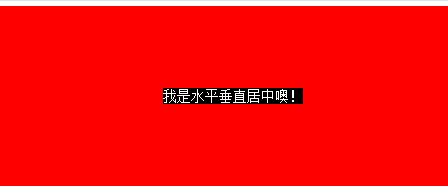
上面講到的div居中的例子中,div的寬度都是固定的,然而實際項目中,有可能遇到不定寬的div,特別是響應(yīng)式或者移動端的設(shè)計中,更加常見。所以下面介紹一種不需要定寬的div水平垂直居中方法。
先上代碼:
<div class="parent">
  <div class="children">
    <div class="children-inline">我是水平垂直居中噢!</div>
  </div>
</div>
.parent {
 float: left;
 width: 100%;
 height: 200px;
 background-color: red;
}
.children {
 float:left;
 position:relative;
 top:50%;
 left:50%;
}
.children-inline {
 position: relative;
 left: -50%;
 -webkit-transform : translate3d(0, -50%, 0);
 transform : translate3d(0, -50%, 0);
 background-color: black;
 color:white;
}
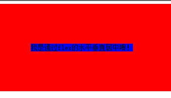
<div class="parent">
  <div class="children">我是通過flex的水平垂直居中噢!</div>
</div>
html,body{
 width: 100%;
 height: 200px;
}
.parent {
 display:flex;
 align-items: center;/*垂直居中*/
 justify-content: center;/*水平居中*/
 width:100%;
 height:100%;
 background-color:red;
}
.children {
 background-color:blue;
}
程序員人生,我編程,我富裕,記住wfuyu網(wǎng),php教程,php學(xué)習(xí),php手冊,CMS模版制作
聲明:本站大部分內(nèi)容是作者原創(chuàng),少部分收集于互聯(lián)網(wǎng)供大家一起學(xué)習(xí),原版權(quán)很多不明,如有侵權(quán)請聯(lián)系本站,謝謝!
粵ICP備14040726號-1?? 2015-2020 程序員人生 版權(quán)所有
站")

