[置頂] 設計兼容不同的屏幕尺寸的Android界面
來源:程序員人生 發布時間:2015-02-03 09:24:46 閱讀次數:2526次
Android的屏幕類型有幾百種不同的尺寸,從小型的手機到大型的電視機。因此要使我們的利用程序兼容不同屏幕尺寸,才可讓我們的利用提供給更多的用戶使用。
1、支持不同的屏幕尺寸
1、使用“wrap_content"和”match_parent"
為了確保布局的靈活性,來適應不同尺寸的屏幕,我們應當使用“wrap_content"來匹配組件的最小尺寸和使用”match_parent"來設置某些視圖來匹配父視圖的大小。這樣設置和直接設置視圖大小(如48dip)不同的是該視圖的空間可以隨著屏幕尺寸(父視圖的大小)隨便擴大。例如以下布局:
<LinearLayout xmlns:android = "http://schemas.android.com/apk/res/android"
android:orientation = "vertical"
android:layout_width = "match_parent"
android:layout_height = "match_parent" >
<LinearLayout android:layout_width = "match_parent"
android:id = "@+id/linearLayout1"
android:gravity = "center"
android:layout_height = "50dp" >
<ImageView android:id = "@+id/imageView1"
android:layout_height = "wrap_content"
android:layout_width = "wrap_content"
android:src = "@drawable/logo"
android:paddingRight = "30dp"
android:layout_gravity = "left"
android:layout_weight = "0" />
<View android:layout_height = "wrap_content"
android:id = "@+id/view1"
android:layout_width = "wrap_content"
android:layout_weight = "1" />
<Button android:id = "@+id/categorybutton"
android:background = "@drawable/button_bg"
android:layout_height = "match_parent"
android:layout_weight = "0"
android:layout_width = "120dp"
style = " @ style / CategoryButtonStyle " />
</LinearLayout>
<fragment android:id = "@+id/headlines"
android:layout_height = "fill_parent"
android:name = "com.example.android.newsreader.HeadlinesFragment"
android:layout_width = "match_parent" />
</LinearLayout>
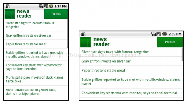
當我們翻轉手機屏幕可以看到橫向和豎向的屏幕適配以下:
2、使用Relative_layout
我們可使用LinearLayout通過“wrap_content"和”match_parent"來實現很多復雜的布局,但是LinearLayout善于控制的是線性的關系,如果是要精確控制平面關系,使用Relative_layout比較適合,它可以指定兩個組件之間的空間關系。例以下面代碼:
<?xml的version = "1.0" encoding = "utf⑻" ?>
<RelativeLayout xmlns:android = "http://schemas.android.com/apk/res/android"
android:layout_width = "match_parent"
android:layout_height = "match_parent" >
<TextView
android:id = "@+id/label"
android:layout_width = "match_parent"
android:layout_height = "wrap_content"
android:text = "Type here:" />
<EditText
android:id = "@+id/entry"
android:layout_width = "match_parent"
android:layout_height = "wrap_content"
android:layout_below = "@id/label" />
<Button
android:id = "@+id/ok"
android:layout_width = "wrap_content"
android:layout_height = "wrap_content"
android:layout_below = "@id/entry"
android:layout_alignParentRight = "true"
android:layout_marginLeft = "10dp"
android:text = "OK" />
<Button
android:layout_width = "wrap_content"
android:layout_height = "wrap_content"
android:layout_toLeftOf = "@id/ok"
android:layout_alignTop = "@id/ok"
android:text = "Cancel" />
</RelativeLayout>
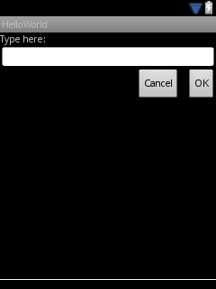
在小屏幕尺寸的QVGA手機上顯示以下:
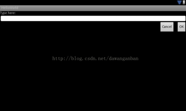
在大屏幕的WSVGA屏幕上顯示以下:
3、使用尺寸限定符
上面我們通過“wrap_content"、”match_parent"、“relative_layout"的方法來實現不同屏幕尺寸的視圖舒展,有效的解決了屏幕尺寸問題,除這些方法外我們還可使用尺寸限定符來針對不同的屏幕來做特殊的界面布局。
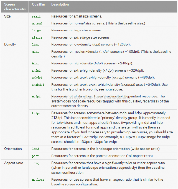
第1列是屏幕的特點,有尺寸、密度、方向、長寬比
第2列是限定符的寫法(如large,我們就需要建立1個文件夾名稱為layout-large)
第3列是相干解釋和描寫
例如我們現在在我們的res下建立兩個文件夾通過不同的限定符文件夾名稱來匹配不同尺寸的屏幕
res/layout/main.xml
<LinearLayout xmlns:android = "http://schemas.android.com/apk/res/android"
android:orientation = "vertical"
android:layout_width = "match_parent"
android:layout_height = "match_parent" >
<fragment android:id = "@+id/headlines"
android:layout_height = "fill_parent"
android:name = "com.example.android.newsreader.HeadlinesFragment"
android:layout_width = "match_parent" />
</LinearLayout>
res/layout-large/main.xml
<LinearLayout xmlns:android = "http://schemas.android.com/apk/res/android"
android:layout_width = "fill_parent"
android:layout_height = "fill_parent"
android:orientation = "horizontal" >
<fragment android:id = "@+id/headlines"
android:layout_height = "fill_parent"
android:name = "com.example.android.newsreader.HeadlinesFragment"
android:layout_width = "400dp"
android:layout_marginRight = "10dp" />
<fragment android:id = "@+id/article"
android:layout_height = "fill_parent"
android:name = "com.example.android.newsreader.ArticleFragment"
android:layout_width = "fill_parent" />
</LinearLayout>
上面布局中在大屏幕中我們將兩個大視圖放到了全部屏幕,2小屏幕中我們只放置了1個視圖。我們的裝備會根據屏幕尺寸來自動尋覓自己的布局。
4、使用最小寬度限定符
上面根據屏幕尺寸來匹配不同的布局文件,但是很多時候我們可能在不同的大屏手機中需要分別顯示不同的布局(例如Galaxy Tab顯示5個還是7個),在Android3.2以后就有了最小寬度限定符來解決這個問題。
假定sw600dp來表示我們的最小寬度,則布局文件就能夠有以下表示:
小屏幕手機適配的布局 res/layout/main.xml
<LinearLayout xmlns:android = "http://schemas.android.com/apk/res/android"
android:orientation = "vertical"
android:layout_width = "match_parent"
android:layout_height = "match_parent" >
<fragment android:id = "@+id/headlines"
android:layout_height = "fill_parent"
android:name = "com.example.android.newsreader.HeadlinesFragment"
android:layout_width = "match_parent" />
</LinearLayout>
裝備寬度大于或等于600dp的布局 res/layout/layout-sw600dp.xml
<LinearLayout xmlns:android = "http://schemas.android.com/apk/res/android"
android:layout_width = "fill_parent"
android:layout_height = "fill_parent"
android:orientation = "horizontal" >
<fragment android:id = "@+id/headlines"
android:layout_height = "fill_parent"
android:name = "com.example.android.newsreader.HeadlinesFragment"
android:layout_width = "400dp"
android:layout_marginRight = "10dp" />
<fragment android:id = "@+id/article"
android:layout_height = "fill_parent"
android:name = "com.example.android.newsreader.ArticleFragment"
android:layout_width = "fill_parent" />
</LinearLayout>
要注意的是這類限定符在3.2之前的版本手機上是不支持的。在3.2之前還必須用尺寸限定符large來代替。
5、使用layout別名
綜合上面的分析,如果我們要支持1個包括大屏幕尺寸的裝備必須包括例以下面幾個布局來匹配
res/layout/main.xml
res/layout/layout-large
res/layout/layout-sw600dp
最后這兩個文件的作用是相同的,是為了支持3.2以下和以上版本,為了不混淆和保護難度,我們可以給這些布局起別名,比以下面的布局名:
res/layout/main.xml 單面板布局
res/layout/main_twopanes.xml 雙面板布局
并添加這兩個文件
res/values-large/layout.xml
<resources>
<item name="main" type="layout">@layout/main_twopanes</item>
</resources>
res/values-sw600dp/layout.xml
<resources>
<item name="main" type="layout">@layout/main_twopanes</item>
</resources>
可以看到這兩個文件的內容相同,他們只是建立起1個main和mian_twospanes的聯系,可以通過屏幕尺寸來分別獲得不同的value文件下所對應的布局文件別名。
6、使用方向限定符
有的時候我們的利用可能需要翻轉手性能取得更好的效果,此時的布局也需要做相應的改變,也能夠分別做出對應的布局文件。請參照上面的表格(land 和 port)。
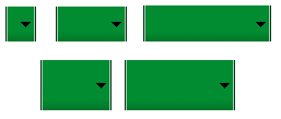
7、使用Nine-Patch圖
對不同的屏幕尺寸通常我們需要使用不同尺寸的圖片資源,所以在設計可變大小的組件時,1定要使用Nine-Patch圖。
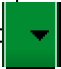
如上圖的Nine-Patch圖在不同尺寸手機上的拉伸效果以下:
有關Nine-Patch的制作方法請參考我的另外一篇博文:http://blog.csdn.net/dawanganban/article/details/17379193
2、支持不同的屏幕密度
我們在設計布局的時候不能使用絕對的像素尺寸,而應當使用dp和sp.不同裝備具有不同的屏幕密度,1英寸的不同密度手機上的像素個數是不同的。為了讓大家弄清楚這些基本概念,我逐1解釋1下:
dpi 像素密度:像素密度,即每英寸屏幕所具有的像素數,像素密度越大,顯示畫面細節就越豐富。
我們可以用這個公式表示 1dpi = 1pix / 1in
dp (dip)裝備獨立像素:在屏幕密度為160的顯示屏上,1dip=1px
有了這些概念,我們來算1下,1dip是多長(是多少英寸)
result = in / dip
result = in / px (根據dp的定義)
result = 1 / (px / in)
result = 1 / dpi
result = 1 / 160
從上面的推導可以看出在屏幕密度為160的顯示屏上 1dip其實就是 1 / 160 英寸,是1個屏幕尺寸上的絕對單位。
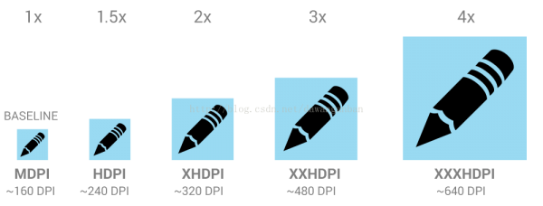
Android中為我們提供了適配不同分辨率的資源包,我們只需要做1套資源就能夠自動幫我們換算成相應dpi(分辨率)下的尺寸,放大及縮小比例如上圖所示。
3、不同UI的代碼邏輯適配
1、肯定當前布局
public class NewsReaderActivity extends FragmentActivity {
boolean mIsDualPane ;
@Override
public void onCreate ( Bundle savedInstanceState ) {
super . onCreate ( savedInstanceState );
setContentView ( R . layout . main_layout );
View articleView = findViewById ( R . id . article );
mIsDualPane = articleView != null &&
articleView . getVisibility () == View . VISIBLE ;
}
}
如上面代碼,我們可以通過某些View的可見性來判斷選用的布局文件。
2、根據不同的布局,做出不同的邏輯
@Override
public void onHeadlineSelected(int index) {
mArtIndex = index;
if (mIsDualPane) {
/* display article on the right pane */
mArticleFragment.displayArticle(mCurrentCat.getArticle(index));
} else {
/* start a separate activity */
Intent intent = new Intent(this, ArticleActivity.class);
intent.putExtra("catIndex", mCatIndex);
intent.putExtra("artIndex", index);
startActivity(intent);
}
}
3、使用代碼片斷實現重用
<LinearLayout xmlns:android = "http://schemas.android.com/apk/res/android"
android:layout_width = "fill_parent"
android:layout_height = "fill_parent"
android:orientation = "horizontal" >
<fragment android:id = "@+id/headlines"
android:layout_height = "fill_parent"
android:name = "com.example.android.newsreader.HeadlinesFragment"
android:layout_width = "400dp"
android:layout_marginRight = "10dp" />
<fragment android:id = "@+id/article"
android:layout_height = "fill_parent"
android:name = "com.example.android.newsreader.ArticleFragment"
android:layout_width = "fill_parent" />
</LinearLayout>
生活不易,碼農辛苦
如果您覺得本網站對您的學習有所幫助,可以手機掃描二維碼進行捐贈


