
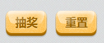
本人仿照20個漂亮 CSS3 按鈕效果及優(yōu)秀的制作教程中的BonBon(Candy)Button實現(xiàn)了其棒棒糖果按鈕,以下圖所示:
在線演示地址見here。
使用完全使用CSS實現(xiàn),無需JS。源碼以下:
<html>
    <head>
        <meta charset="utf⑻"/>
        <style type="text/css">
            *{ margin: 0px;  padding: 0px;}

            /*按鈕未被訪問的樣式*/
            .btn{
                display:inline-block;
                position:relative;
                margin:5px 5px;
                border-radius:10px;          /*CSS3標準屬性*/
                -webkit-border-radius:10px;  /*for Google Chrome、Apple Safari*/
                -moz-border-radius:10px;     /*for Mozilla Firefox*/
                font:bold 22px/100% "微軟雅黑";
                color: hsl(39, 100%, 30%);
                background-color: hsl(39, 100%, 50%);
                padding: 0.5em 0.8em 0.4em 0.8em;

                box-shadow:rgba(255, 254, 255, 0.6) 0 0.3em 0.3em inset,hsl(39,100%,40%) 0 0.1em 3px,hsl(39,100%,30%) 0 0.3em 1px,rgba(0,0,0, 0.2) 0 0.4em 3px;
                -webkit-box-shadow:rgba(255, 254, 255, 0.6) 0 0.3em 0.3em inset,hsl(39,100%,40%) 0 0.1em 3px,hsl(39,100%,30%) 0 0.3em 1px,rgba(0,0,0, 0.2) 0 0.4em 3px;
                -moz-box-shadow:rgba(255, 254, 255, 0.6) 0 0.3em 0.3em inset,hsl(39,100%,40%) 0 0.1em 3px,hsl(39,100%,30%) 0 0.3em 1px,rgba(0,0,0, 0.2) 0 0.4em 3px;

                background-image:-webkit-gradient(radial, 50% 0, 100, 50% 0, 0, from(rgba(255, 255, 255,0) ),to( rgba(255, 255, 255, 0.5) )),url(img/noise.png);
                border-bottom: 1px solid rgba(255,255,255,0.3);
                cursor:pointer;
                text-shadow:rgba(255,255,255,.5) 0 1px 0;

                transition:border-radius 0.5s ease-in-out;
                -webkit-transition: -webkit-border-radius 0.5s ease-in-out;
                -moz-transition: -moz-border-radius 0.5s ease-in-out;
            }

            /*鼠標指針懸停在按鈕上的樣式*/
            .btn:hover{
                background-image:-webkit-gradient(radial,50% 0,100,50% 0,0,from(rgba(255,255,255,0)),to(rgba(255,255,255,0.7))),url(img/noise.png);
                border-radius:10px 10px 2em 2em/10px 10px 2em 2em;
            }

            /*按鈕正在被點擊的樣式*/
            .btn:active{
                background-image:-webkit-gradient(radial,50% 0,100,50% 0,0,from(rgba(255,255,255,0)),to(rgba(255,255,255,0.3))),url(img/noise.png);
                padding: 0.5em 0.8em;
                box-shadow:rgba(0,0,0,0.6) 0 0.1em 1px,rgba(255, 254, 255, 0.6) 0 0.3em 0.3em inset;
                border-bottom:none;
                top:3px;
            }

            /*產(chǎn)生高光*/
            .btn:after {
                content: "";
                position: absolute;
                width: 90%;
                height: 60%;
                top:0;
                left: 5%;
                background-image:-webkit-gradient(linear,left center,right center,from(rgba(255,255,255,0.5)),color-stop(0.6,rgba(255,255,255,0)),color-stop(0.8,rgba(255,255,255,0)),to(rgba(255,255,255,0.5)));
                -webkit-border-radius: .5em .5em 1em 1em / .5em .5em 2em 2em;
            }
        </style>
    </head>
    <body>
        <a id="btnChoujiang" class="btn">抽獎</a>
        <a id="btnReset" class="btn">重置</a>
    </body>
</html>
解讀源碼注意以下幾點:
(1)之所以使用a標簽作為按鈕,而不使用button標簽,是由于可以通過a的active樣式為按鈕設置更多的樣式,增加美觀度;
(2)重點掌握box-shadow、border-radius、-webkit-gradient、transition的用法,文中按鈕使用了4重box-shadow,按鈕背景圖片使用了徑向漸變,高光使用了線性漸變,CSS屬性變化使用了transition過渡效果。
如果疑問,請留言討論。
[1]BonBon Candy Button

程序員人生,我編程,我富裕,記住wfuyu網(wǎng),php教程,php學習,php手冊,CMS模版制作
聲明:本站大部分內容是作者原創(chuàng),少部分收集于互聯(lián)網(wǎng)供大家一起學習,原版權很多不明,如有侵權請聯(lián)系本站,謝謝!
粵ICP備14040726號-1?? 2015-2020 程序員人生 版權所有
站")


