
你會看到,不論是甚么布局,Flex常常都可以幾行命令弄定。
我只列出代碼,詳細的語法解釋請查閱《Flex布局教程:語法篇》。我的主要參考資料是Landon Schropp的文章和Solved by Flexbox。
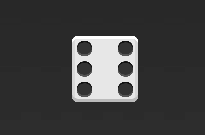
骰子的1面,最多可以放置9個點。
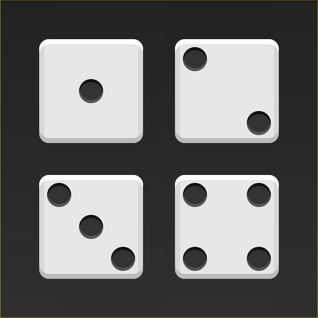
下面,就來看看Flex如何實現,從1個點到9個點的布局。你可以到codepen查看Demo。
如果不加說明,本節的HTML模板1律以下。
<div class="box"> <span class="item"></span> </div>
上面代碼中,div元素(代表骰子的1個面)是Flex容器,span元素(代表1個點)是Flex項目。如果有多個項目,就要添加多個span元素,以此類推。
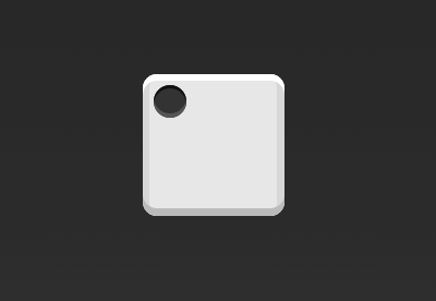
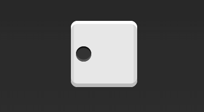
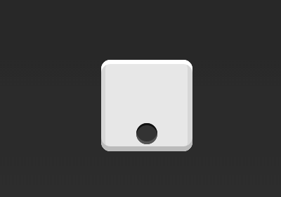
首先,只有左上角1個點的情況。Flex布局默許就是首行左對齊,所以1行代碼就夠了。
.box { display: flex; }
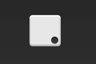
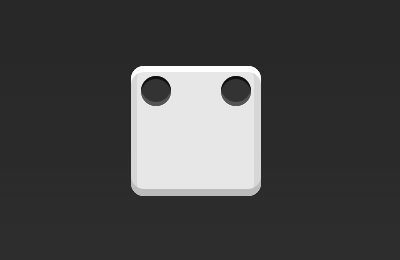
設置項目的對齊方式,就可以實現居中對齊和右對齊。
.box { display: flex; justify-content: center; }
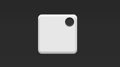
.box { display: flex; justify-content: flex-end; }
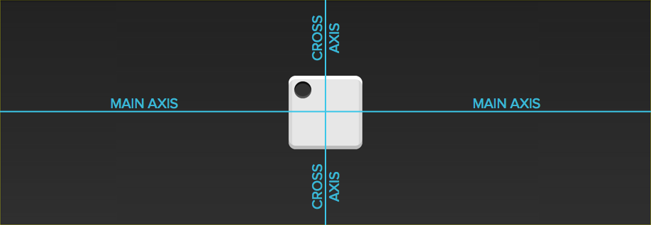
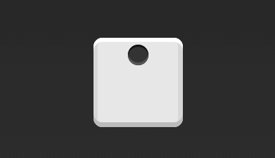
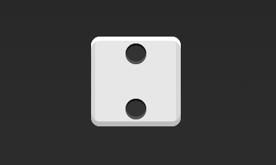
設置交叉軸對齊方式,可以垂直移動主軸。
.box { display: flex; align-items: center; }
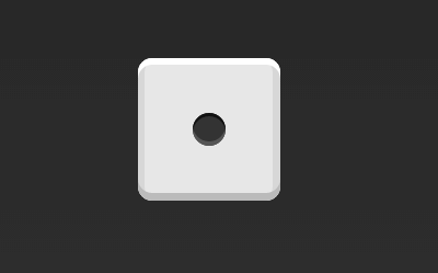
.box { display: flex; justify-content: center; align-items: center; }
.box { display: flex; justify-content: center; align-items: flex-end; }
.box { display: flex; justify-content: flex-end; align-items: flex-end; }
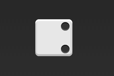
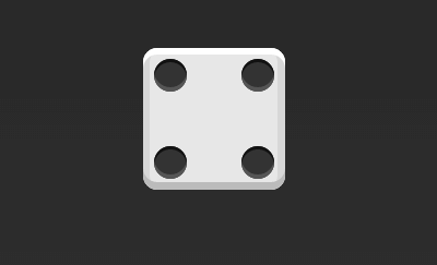
.box { display: flex; justify-content: space-between; }
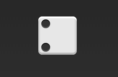
.box { display: flex; flex-direction: column; justify-content: space-between; }
.box { display: flex; flex-direction: column; justify-content: space-between; align-items: center; }
.box { display: flex; flex-direction: column; justify-content: space-between; align-items: flex-end; }
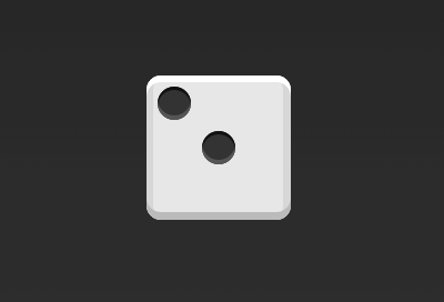
.box { display: flex; } .item:nth-child(2) { align-self: center; }
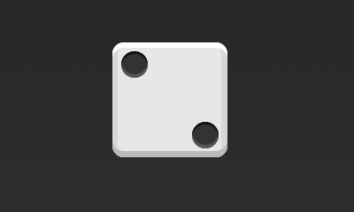
.box { display: flex; justify-content: space-between; } .item:nth-child(2) { align-self: flex-end; }
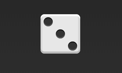
.box { display: flex; } .item:nth-child(2) { align-self: center; } .item:nth-child(3) { align-self: flex-end; }
.box { display: flex; flex-wrap: wrap; justify-content: flex-end; align-content: space-between; }
HTML代碼以下。
<div class="box"> <div class="column"> <span class="item"></span> <span class="item"></span> </div> <div class="column"> <span class="item"></span> <span class="item"></span> </div> </div>
CSS代碼以下。
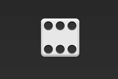
.box { display: flex; flex-wrap: wrap; align-content: space-between; } .column { flex-basis: 100%; display: flex; justify-content: space-between; }
.box { display: flex; flex-wrap: wrap; align-content: space-between; }
.box { display: flex; flex-direction: column; flex-wrap: wrap; align-content: space-between; }
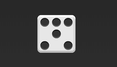
HTML代碼以下。
<div class="box"> <div class="row"> <span class="item"></span> <span class="item"></span> <span class="item"></span> </div> <div class="row"> <span class="item"></span> </div> <div class="row"> <span class="item"></span> <span class="item"></span> </div> </div>
CSS代碼以下。
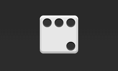
.box { display: flex; flex-wrap: wrap; } .row{ flex-basis: 100%; display:flex; } .row:nth-child(2){ justify-content: center; } .row:nth-child(3){ justify-content: space-between; }
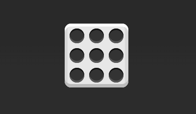
.box { display: flex; flex-wrap: wrap; }
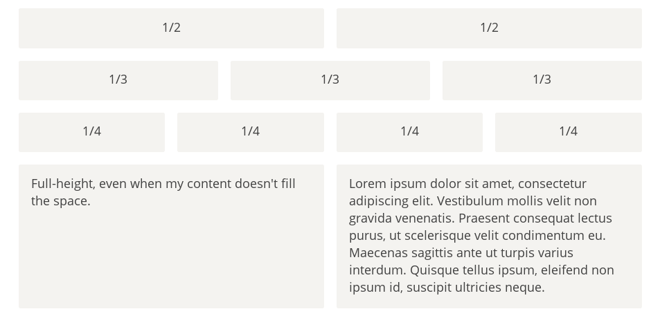
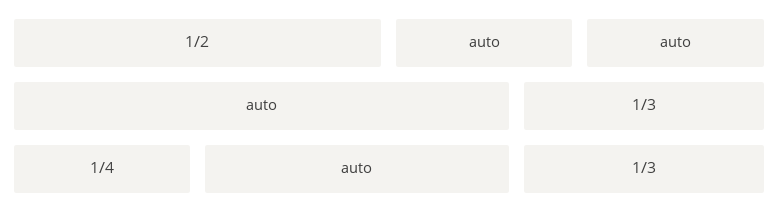
最簡單的網格布局,就是平均散布。在容器里面平均分配空間,跟上面的骰子布局很像,但是需要設置項目的自動縮放。
HTML代碼以下。
<div class="Grid"> <div class="Grid-cell">...</div> <div class="Grid-cell">...</div> <div class="Grid-cell">...</div> </div>
CSS代碼以下。
.Grid { display: flex; } .Grid-cell { flex: 1; }
某個網格的寬度為固定的百分比,其余網格平均分配剩余的空間。
HTML代碼以下。
 <div class="Grid"> <div class="Grid-cell u⑴of4">...</div> <div class="Grid-cell">...</div>
 生活不易,碼農辛苦

 如果您覺得本網站對您的學習有所幫助,可以手機掃描二維碼進行捐贈

上一篇 VC++調試常見錯誤總結
程序員人生,我編程,我富裕,記住wfuyu網,php教程,php學習,php手冊,CMS模版制作
聲明:本站大部分內容是作者原創,少部分收集于互聯網供大家一起學習,原版權很多不明,如有侵權請聯系本站,謝謝!
粵ICP備14040726號-1?? 2015-2020 程序員人生 版權所有


