echarts-設置折線圖中折線線條顏色和折線點顏色
來源:程序員人生 發布時間:2016-08-29 09:10:37 閱讀次數:10137次
1、問題背景
設計1條折線圖,但是圖形中不用插件自帶的色彩,需要自定義線條和折點的色彩
2、實現源碼
(1)圖形自分配色彩
<!DOCTYPE html>
<html>
<head>
<meta charset="UTF⑻">
<title>echarts-設置折線圖中折線線條色彩和折線點色彩</title>
<link rel="shortcut icon" href="../js/echarts⑵.2.7/doc/asset/ico/favicon.png">
<script type="text/javascript" src="../js/echarts⑵.2.7/doc/asset/js/
jquery.min.js" ></script>
<script type="text/javascript" src="../js/echarts⑵.2.7/doc/example/www2/js/echarts-all.js" ></script>
<style>
body,html{
width: 99%;
height: 99%;
font-family: "微軟雅黑";
font-size: 12px;
}
#line{
width: 100%;
height: 100%;
}
</style>
<script>
$(function(){
var chart = document.getElementById('line');
var echart = echarts.init(chart);
var option = {
title: {
text: ''
},
tooltip: {
trigger: 'axis'
},
legend: {
data:['銷售量']
},
grid: {
left: '3%',
right: '4%',
bottom: '3%',
containLabel: true
},
toolbox: {
feature: {
saveAsImage: {}
}
},
xAxis: {
type: 'category',
boundaryGap: false,
data: ['周1','周2','周3','周4','周5','周6','周日']
},
yAxis: {
type: 'value'
},
series: [
{
name:'銷售量',
type:'line',
stack: '銷售量',
data:[220, 132, 601, 314, 890, 230, 510]
}
]
};
echart.setOption(option);
});
</script>
</head>
<body>
<div id="line"></div>
</body>
</html>
(2)線條自定義色彩
<!DOCTYPE html>
<html>
<head>
<meta charset="UTF⑻">
<title>echarts-設置折線圖中折線線條色彩和折線點色彩</title>
<link rel="shortcut icon" href="../js/echarts⑵.2.7/doc/asset/ico/favicon.png">
<script type="text/javascript" src="../js/echarts⑵.2.7/doc/asset/js/
jquery.min.js" ></script>
<script type="text/javascript" src="../js/echarts⑵.2.7/doc/example/www2/js/echarts-all.js" ></script>
<style>
body,html{
width: 99%;
height: 99%;
font-family: "微軟雅黑";
font-size: 12px;
}
#line{
width: 100%;
height: 100%;
}
</style>
<script>
$(function(){
var chart = document.getElementById('line');
var echart = echarts.init(chart);
var option = {
title: {
text: ''
},
tooltip: {
trigger: 'axis'
},
legend: {
data:['銷售量']
},
grid: {
left: '3%',
right: '4%',
bottom: '3%',
containLabel: true
},
toolbox: {
feature: {
saveAsImage: {}
}
},
xAxis: {
type: 'category',
boundaryGap: false,
data: ['周1','周2','周3','周4','周5','周6','周日']
},
yAxis: {
type: 'value'
},
series: [
{
name:'銷售量',
type:'line',
stack: '銷售量',
itemStyle : {
normal : {
lineStyle:{
color:'#00FF00'
}
}
},
data:[220, 132, 601, 314, 890, 230, 510]
}
]
};
echart.setOption(option);
});
</script>
</head>
<body>
<div id="line"></div>
</body>
</html>
(3)折點自定義色彩
<!DOCTYPE html>
<html>
<head>
<meta charset="UTF⑻">
<title>echarts-設置折線圖中折線線條色彩和折線點色彩</title>
<link rel="shortcut icon" href="../js/echarts⑵.2.7/doc/asset/ico/favicon.png">
<script type="text/javascript" src="../js/echarts⑵.2.7/doc/asset/js/
jquery.min.js" ></script>
<script type="text/javascript" src="../js/echarts⑵.2.7/doc/example/www2/js/echarts-all.js" ></script>
<style>
body,html{
width: 99%;
height: 99%;
font-family: "微軟雅黑";
font-size: 12px;
}
#line{
width: 100%;
height: 100%;
}
</style>
<script>
$(function(){
var chart = document.getElementById('line');
var echart = echarts.init(chart);
var option = {
title: {
text: ''
},
tooltip: {
trigger: 'axis'
},
legend: {
data:['銷售量']
},
grid: {
left: '3%',
right: '4%',
bottom: '3%',
containLabel: true
},
toolbox: {
feature: {
saveAsImage: {}
}
},
xAxis: {
type: 'category',
boundaryGap: false,
data: ['周1','周2','周3','周4','周5','周6','周日']
},
yAxis: {
type: 'value'
},
series: [
{
name:'銷售量',
type:'line',
stack: '銷售量',
itemStyle : {
normal : {
color:'#00FF00',
lineStyle:{
color:'#00FF00'
}
}
},
data:[220, 132, 601, 314, 890, 230, 510]
}
]
};
echart.setOption(option);
});
</script>
</head>
<body>
<div id="line"></div>
</body>
</html>
3、實現結果
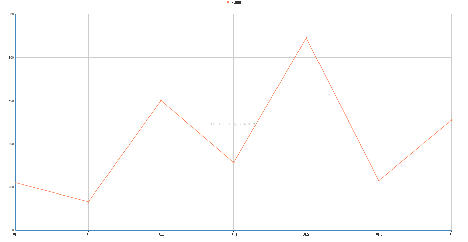
(1)圖形自分配色彩
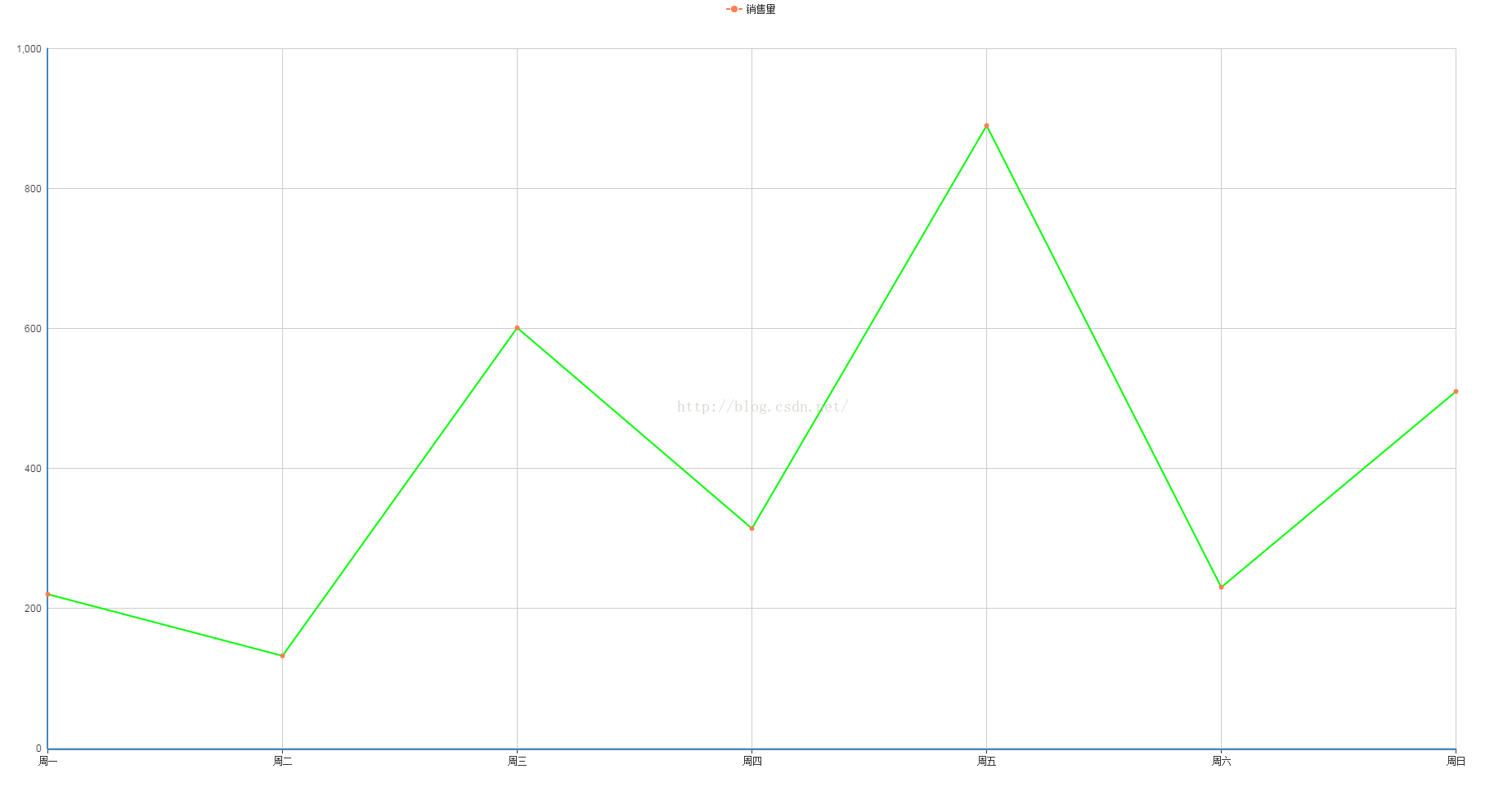
(2)線條自定義色彩
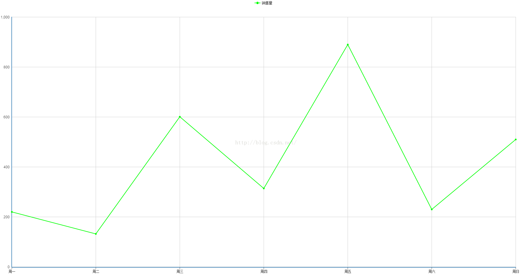
(3)折點自定義色彩
4、問題說明
(1)設置折線線條色彩
lineStyle:{
color:'#00FF00'
}
(2)設置折線折點色彩
itemStyle : {
normal : {
color:'#00FF00'
}
}
生活不易,碼農辛苦
如果您覺得本網站對您的學習有所幫助,可以手機掃描二維碼進行捐贈