本課程為網易云課堂 - - 前端開發工程師 - - 《頁面架構》學習總結
居中布局
問題1:水平列表的底部對齊
如圖所示,1個水平排列的列表,每項高度都未知,但要求底部對齊,有哪些方法可以解決呢?
????
解決方案:
-
方法1:子元素設置:display:inline-block + vertical-align:bottom
<html> <head> <meta charset="utf⑻"> <title>水平列表的底部對齊title> <style type="text/css"> .parent{ height:500px; width:800px; border:1px solid #CCC; text-align:center; } .child{ display:inline-block; vertical-align:bottom; } .child_a{ width:150px; height:100%; background:red; } .child_b{ width:150px; height:75%; background:green; } .child_c{ width:150px; height:50%; background:black; } .child_d{ width:150px; height:25%; background:yellow; } style> head> <body> <div class="parent"> <div class="child child_a">我是最左側的div> <div class="child child_b">我是老2,嘿嘿div> <div class="child child_c">我是倒數第2!能看到我嗎?div> <div class="child child_d">我是倒數第1吆~div> div> body> html>
-
方法2:position:relative + 子元素:position:absolute + bottom:0
<html> <head> <meta charset="utf⑻"> <title>水平列表的底部對齊title> <style type="text/css"> .parent{ height:500px; width:800px; border:1px solid #CCC; text-align:center; position:relative; } .child{ position:absolute; bottom:0; } .child_a{ width:150px; height:100%; left:15px; background:red; } .child_b{ width:150px; left:180px; height:75%; background:green; } .child_c{ width:150px; left:345px; height:50%; background:black; } .child_d{ width:150px; left:510px; height:25%; background:yellow; } style> head> <body> <div class="parent"> <div class="child child_a">我是最左側的div> <div class="child child_b">我是老2,嘿嘿div> <div class="child child_c">我是倒數第2!能看到我嗎?div> <div class="child child_d">我是倒數第1吆~div> div> body> html>
-
方法3:父元素:dispaly:flex + align-items:flex-end
<html> <head> <meta charset="utf⑻"> <title>水平列表的底部對齊title> <style type="text/css"> .parent{ height:500px; width:800px; border:1px solid #CCC; text-align:center; display:flex; align-items:flex-end; } .child{ margin-left:15px; } .child_a{ width:150px; height:100%; background:red; } .child_b{ width:150px; height:75%; background:green; } .child_c{ width:150px; height:50%; background:black; } .child_d{ width:150px; height:25%; background:yellow; } style> head> <body> <div class="parent"> <div class="child child_a">我是最左側的div> <div class="child child_b">我是老2,嘿嘿div> <div class="child child_c">我是倒數第2!能看到我嗎?div> <div class="child child_d">我是倒數第1吆~div> div> body> html>
??相干重點文章推薦:
??《CSS3實戰》筆記–彈性盒模型(1)
??《CSS3實戰》筆記–彈性盒模型(2)
??《CSS3實戰》筆記–彈性盒模型(3)
<html> <head> <meta charset="utf⑻"> <title>水平列表的底部對齊title> <style type="text/css"> .parent{ height:500px; width:800px; border:1px solid #CCC; display:box; // 設置為盒子顯示 display:-moz-box; display:-webkit-box; orient:horizontal; // 定義父元素內子元素的活動 -mozbox-orient:horizontal; -webkit-orient:horizontal; box-align:end; -moz-box-align:end; -webkit-box-align:end; } .child{ } .child_a{ width:200px; height:500px; background:red; } .child_b{ background:green; width:200px; height:350px; } .child_c{ background:black; height:250px; width:200px; } .child_d{ width:200px; height:150px; background:yellow; } style> head> <body> <div class="parent"> <div class="child child_a">我是最左側的div> <div class="child child_b">我是老2,嘿嘿div> <div class="child child_c">我是倒數第2!能看到我嗎?div> <div class="child child_d">我是倒數第1吆~div> div> body> html>
問題2:實現1個幻燈布局
??1個幻燈片效果如圖:
????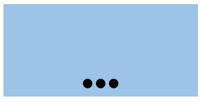
??已知結構以下:
<div class="slide"> <div class="pointer"><i>i><i>i><i>i>div> div>
??要求以下:幻燈(slide)寬高未知,唆使器(pointer)在底部且水平居中,距離底部10px,唆使器中的圓直徑為10px,個數未知,背景為黑色,間距為5px,請完成CSS。
??解答:
<html> <head> <meta charset="utf⑻"> <title>幻燈圖title> <style type="text/css"> .slide{ width:600px; height:300px; background:#9dc3e6; position:relative; } .pointer{ position:absolute; left:50%; transform:translate(-50%); bottom:10px; } .pointer i{ display:block; float:left; margin-right:5px; width:10px; height:10px; border-radius:50%; background-color:black; } .pointer i:last-child{ margin-right:0; } style> head> <body> <div class="slide"> <div class="pointer"> <i>i> <i>i> <i>i> div> div> body> html>
多列布局
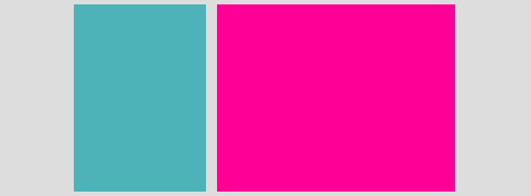
問題1:1個全等4宮格的實現
??1個未知寬高的容器,要被均分為4個相同大小格子(即4個容器),且格子間有10px間距(即10字型空隙),有哪些方法可以解決呢?
????
??方法1:(效果不好,Firefox閱讀器效果基本可以,需要css微調)
<html> <head> <meta charset="UTF⑻"> <title>1個全等4宮格的實現title> <style type="text/css"> *{margin:0;padding:0;} .parent{ border:1px solid #CCC; margin:0 auto; width:420px; height:420px; } .box{ background:#009999; height:200px; width:200px; display:inline-block; } .box:nth-child(1){ margin:0 17px 0 0; } .box:nth-child(even){ margin:0 0 0 -2px; } .box:nth-child(3){ margin:17px 17px 0 0; } style> head> <body> <div class="parent"> <div class="box box1">div> <div class="box box2">div> <div class="box box3">div> <div class="box box4">div> div> body> html>
??方法2: (display:flex)
<html> <head> <meta charset="UTF⑻"> <title>1個全等4宮格的實現title> <style type="text/css"> .parent{ width:410px; height:410px; border: 1px solid #CCC; display:flex; flex-direction:row; flex-wrap:wrap; justify-content:space-between; } .box{ width:200px; height:200px; background:#009999; } .box3{ align-self:flex-end; } .box4{ align-self:flex-end; } style> head> <body> <div class="parent"> <div class="box box1">div> <div class="box box2">div> <div class="box box3">div> <div class="box box4">div> div> body> html>
??方法3:box-sizing:border-box; background-clip:content-box;
<html> <head> <meta charset="UTF⑻"> <title>1個全等4宮格的實現title> <style type="text/css"> html,body{height:100%;} .parent{ width:50%; height:50%; border: 1px solid #CCC; } .box{ background:#009999; float:left; width:50%; height:50%; box-sizing:border-box; background-clip:content-box; } .box1{ padding-right:10px; padding-bottom:10px; } .box2{ padding-bottom:10px; } .box3{ padding-right:10px; } style> head> <body> <div class="parent"> <div class="box box1">div> <div class="box box2">div> <div class="box box3">div> <div class="box box4">div> div> body> html>
全屏布局
問題:已知HTML結構和效果圖以下:
<div class="a">
<div class="b">Hello Worlddiv>
div>
??假定以上父元素稱為A,子元素稱為B
????
??請寫出CSS以實現以下彈窗需求:彈窗(B)固定在閱讀器窗口中間,彈窗背風景為白色,彈窗寬高由其內容決定,彈窗4周為黑色半透明(0.5透明度)遮罩。
??HTML代碼:
<div class="a"> <div class="b"> Hello World div> div>
??CSS代碼:
.a { position: fixed; height: 100%; width: 100%; background-color: #000; opacity: 0.5; filter: alpha(opacity=50); } .b { background-color: #fff; display: inline-block; position: fixed; top: 50%; left: 50%; transform: translate(-50%, -50%); }
響應式
高清屏的背景圖片適配
??當我們把1個圖標做成CSS中的背景圖,在視網膜屏上預覽時會發現圖標是模糊的,所以我們會同時準備1個2倍大小的圖標給高清屏,那末問題來了,怎樣實現在普通屏下是普通背景圖,而在高清屏下是用的高清圖呢?
??解答:
方法1:![]() 標簽援用的圖片
標簽援用的圖片
??通過js做自動適配
<img class="photo" src="./photo.jpg" style="width:300px;height:200px;" /> <script type="text/javascript">$(document).ready(function () { if (window.devicePixelRatio > 1) { var images = $("img.photo");
images.each(function(i) { var x1 = $(this).attr('src'); var x2 = x1.replace(/(.*)(\.\w+)/, "$1@2x$2");
$(this).attr('src', x2);
});
}
});script>
??Retina.js 提供了更加完善的解決方案,自動匹配屏幕分辨率的同時,還可以檢測服務器上是不是存有當前圖片的 @2X 版本,以決定是不是替換。
??優點:
操作簡單

    普通屏幕下不會加載 @2X 的大尺寸圖片,節儉帶寬
??缺點:
Retina 屏幕下,標準圖片和高清的圖片都會被加載

    圖片在顯示進程中會被重繪

    有些老版本閱讀器下存在兼容問題(1些老版本閱讀器如 IE6、7 會顯示得非常失真)
??方法2:CSS的media標簽
@media only screen and (-webkit-min-device-pixel-ratio: 1.5),
       only screen and (min--moz-device-pixel-ratio: 1.5), /* 注意這里的寫法比較特殊 */
       only screen and (-o-min-device-pixel-ratio: 3/2),
       only screen and (min-device-pixel-ratio: 1.5) {
    #logo {
        background-image: url(./logo@2x.png);
        background-size: 100px auto;
    }}
??優點:
只會加載匹配當前裝備的最適圖片

    跨閱讀器兼容
??缺點:
如果背景圖片很多的話,需要編寫非常冗雜的代碼
??方法3:css的image-set方法
background-image: -webkit-image-set(url(./logo.png) 1x, url(./logo@2x.png) 2x)
??**優點:**css中編寫,圖片集中,代碼量少
??缺點:存在兼容性問題,僅支持background-image屬性,而不能使用在“![]() ”標簽中,是css4的草案。
”標簽中,是css4的草案。
問題:完成響應式布局的實現
??已知1個自適應布局的HTML結構以下:
<div class="parent">
<div class="side">div>
<div class="main">div>
div>
??請完成以下響應式要求:
-
默許情況,PC電腦(假定視窗都大于等于1000px)訪問:兩列布局,.parent寬960px且水平居中,左列.side寬300px,右列.main寬650px,列間距10px。
-
當用平板(假定視窗都大于400px且小于1000px)訪問:兩列布局,.parent寬度撐滿,右列.main自適應剩余寬度,兩列間距仍舊為10px。

-
當用手機(假定視窗都小于等于400px)訪問:上下兩行布局,.parent寬度撐滿,.side和.main寬度也撐滿,行間距為10px。
??解答
<html lang="en"> <head> <meta charset="UTF⑻"> <title>完成響應式布局的實現title> <meta name="viewport" content="width=device-width, initial-scale=1.0, user-scalable=no"/> <style type="text/css"> html, body { margin: 0; padding: 0; height: 100%; background-color: lightgray; } .parent { width: 960px; height: 100%; margin: 0 auto; } .side { float: left; background-color: lightblue; width: 300px; height: 100%; }


