

我們來研究下利用AngularJS實現條形圖、折線圖等數據可視化效果。效果以下圖所示。
大家可以到codepen-在線預覽-下載收藏-效果
實現本案例需要具有以下要素:
我們在html中搭建AngularJS的環境,首先引入angularJS,然后聲明ng-app,ng-controller,以下代碼所示。
<script src="http://cdn.bootcss.com/angular.js/1.3.8/angular.js"></script>
<div ng-app="graphApp">
  <div ng-controller="graphController">
    <!-- 數據圖代碼 -->
  </div>
</div>
在javscript中,一樣搭建骨架。
(function(){
  //定義模塊
  var app = angular.module('graphApp',[]);
  //綁定控制器
  app.controller('graphController', function($scope){
    //參數設置

    //數據圖設置

  });// End Controller
})();然后我們放入繪制條形圖的代碼。
    <!-- 數據圖代碼 -->
    <!--bar chart-->
    <div class="chart">
      <!-- 坐標軸 -->
      <div class="y"></div>
      <div class="x"></div>
      <!-- 表格數據 -->
      <div ng-repeat="bar in data" class="bar"></div>
    </div>
我們利用AngualrJS把數據綁定到html中,我們直接把數據放到style屬性里來設置條形圖的寬高、位置。
    <!-- 數據圖代碼 -->
    <!--bar chart-->
    <div class="chart" style="width:{{width}}px; height:{{height}}px;">
      <!-- Labels -->
      <div class="y" style="width:{{height}}px;">{{yAxis}}</div>
      <div class="x">{{xAxis}}</div>
      <!-- Data -->
       <div ng-repeat="bar in data" class="bar" style="height:{{bar.value / max * height}}px; width:{{width / data.length - 5}}px; left:{{$index / data.length * width}}px;"></div>
    </div>
然后我們利用js來設置數據,需要求數據的最大值。
(function(){
//定義模塊
var app = angular.module('graphApp',[]);
//綁定控制器
app.controller('graphController', function($scope){
//參數設置,相對上面代碼,新增內容
$scope.width = 600;
$scope.height = 350;
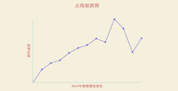
$scope.yAxis = '銷售成績';
$scope.xAxis = '2014年銷售情況變化';
//數據設置
$scope.data = [
{
label: 'January',
value: 36
},
{
label: 'February',
value: 54
},
{
label: 'March',
value: 62
},
{
label: 'April',
value: 82
},
{
label: 'May',
value: 96
},
{
label: 'June',
value: 104
},
{
label: 'July',
value: 122
},
{
label: 'August',
value: 112
},
{
label: 'September',
value: 176
},
{
label: 'October',
value: 150
},
{
label: 'November',
value: 84
},
{
label: 'December',
value: 123
}
];
//求最大值
$scope.max = 0;
var arrLength = $scope.data.length;
for (var i = 0; i < arrLength; i++) {
// Find Maximum X Axis Value
if ($scope.data[i].value > $scope.max)
$scope.max = $scope.data[i].value;
}
});// End Controller
})();固然,css(我們使用scss)里也需要做1些相干設置,以下面代碼所示。
// 布局與樣式
* {box-sizing:border-box;}
h1,h2 {
  color: #D07371;
}
body {
  font-size:1.1em;
  text-align:center;
  background:#F4F0DC;
  color:#444;
}

// 表格設置,設置邊框與相對定位
.chart {
  border-left:1px solid black;
  border-bottom:1px solid black;
  margin:60px auto;
  position:relative;
}
// 坐標軸設置
.y {
  font-weight:bold;
  border-bottom:1px solid #71CBD0;
  position:absolute;
  text-align:center;
  padding: 10px;
  transform: rotate(-90deg);
  transform-origin: bottom left;
  bottom:0;
  color: #D07371;
}
.x {
  font-weight:bold;
  border-top:1px solid #71CBD0;
  position:absolute;
  width: 100%;
  text-align:center;
  padding: 10px;
  top:100%;
  color:#D07371;
}

// 條形圖設置
.bar  {
  background:rgba(0,0,240,0.4);
  position:absolute;
  bottom:0;

  &:nth-of-type(even) {
    background:rgba(200,0,240,0.4);
  }
}對點圖來講,實現原理和條形圖1樣,不再贅述。
對折線圖來講,我們使用svg來繪制線條,代碼以下所示。
    <!--svg line chart-->
    <h2>SVG Line Chart</h2>
    <div class="chart" style="width:{{width}}px; height:{{height}}px;">
      <!-- Labels -->
      <div class="y" style="width:{{height}}px;">{{yAxis}}</div>
      <div class="x">{{xAxis}}</div>
      <!-- Data -->
      <svg style="width:{{width}}px; height:{{height}}px;">
        <line ng-repeat="line in data" x1="{{$index / data.length * width }}" y1="{{data[$index - 1].value / max * height}}" x2="{{($index + 1) / data.length * width}}" y2="{{line.value / max * height}}">
        </line>
      </svg>
    </div>
然后設置CSS
// SVG line chart
svg {
  position:absolute;
  transform:rotateX(180deg);
  left:0;
}
line  {
  stroke:rgba(0,0,200,.4);
  stroke-width:3px;
}
固然,我們也能夠實現多種圖形的混搭,具體代碼參加codepen,-在線預覽-下載收藏-。
前端開發whqet,關注前端開發,分享相干資源。csdn專家博客,王海慶希望能對您有所幫助,限于作者水平有限,出錯難免,歡迎拍磚!
歡迎任何情勢的轉載,煩請注明裝載,保存本段文字。
本文原文鏈接,http://blog.csdn.net/whqet/article/details/44060443
歡迎大家訪問獨立博客http://whqet.github.io

下一篇 用jQuery實現頁面遮罩彈出框
程序員人生,我編程,我富裕,記住wfuyu網,php教程,php學習,php手冊,CMS模版制作
聲明:本站大部分內容是作者原創,少部分收集于互聯網供大家一起學習,原版權很多不明,如有侵權請聯系本站,謝謝!
粵ICP備14040726號-1?? 2015-2020 程序員人生 版權所有


